

Before you — 19 frames, each one assembled and disassembled at the molecular level: how geometry, light, and color work in an interior, and how a photographer steers the viewer’s attention long before they consciously register the composition. This material is structured as a preface to the project PALIMPSEST: ALL ABOUT INTERIOR PHOTOGRAPHY (table of contents ↴) — the largest Q&A collection for practicing photographers in the Russian internet.
Dissecting an Interior of One Room Under a Microscope from RAW to Final
Project shot for the architecture firm MIM design, headed by Ilya Makotinsky.
📌Geometry as a Vector 🎞️ The project’s author tied the kitchen, dining room, and living room into a single, cohesive volume. Through-axes work as vectors: tracks on the ceiling, the seams of the floor coverings — everything leads the eye deeper. The orange leather of the furniture serves as a rhythmic marker. It stitches the zones into a composition.


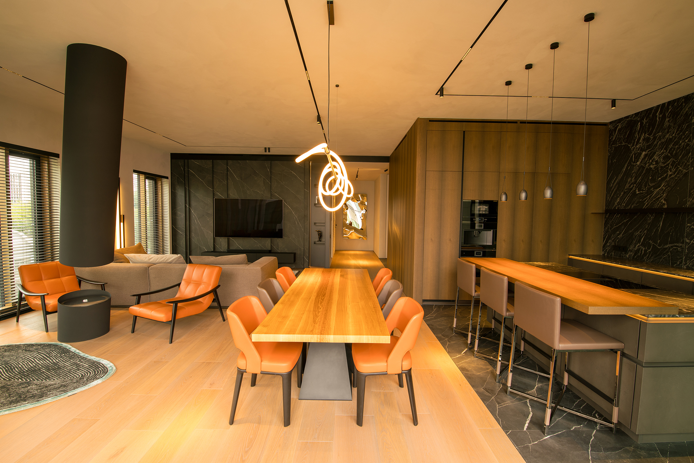
In B&W, architecture reads like a blueprint — light and shadow instead of color. † Two challenges are constantly at play in this shoot. The first — a double drop-off: the sun-drenched terrace in the back and the kitchen zone on the right are worlds apart in tonality — in both light and color. The second, overarching one — geometry.
Without tilt-shift glass, a camera set level at a height of 150–180 cm gives you too much empty ceiling and a chopped-off foreground. You have to deliberately raise the shooting point — here it’s slightly from above, which is noticeable by looking at the edges. The stray verticals are corrected in post-production.
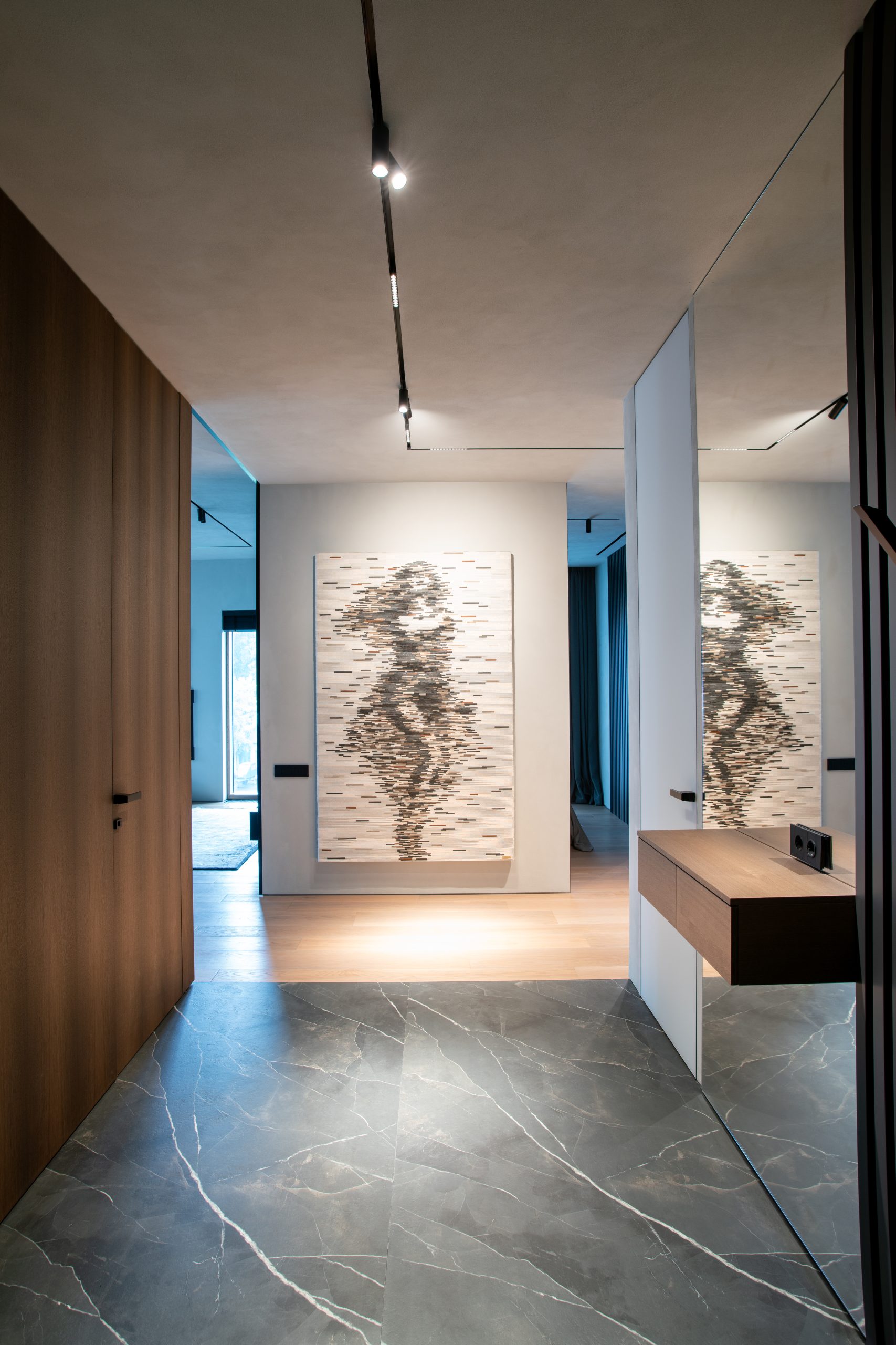
📌Mirror and Projection 🎞️ The entryway is a stark, graphic portal. The mirror on the right doubles the hall, creating a symmetrical projection of the large painting at the end. The dark marble floor — with its reflections and veining — leads the eye toward the lighter floors of the living room. The camera is positioned perfectly parallel to the plane of the painting: this maintains a correct projection in the mirror.


📌A See-Through Perspective 🎞️ opens up from the deepest point of the kitchen. The edge of the island in the foreground acts as a kind of wing. Behind it, layers unfold: the rhythm of the droplet pendants, the dining table, the fireplace, the sofa group, and the marble wall at the very end. Monumental.

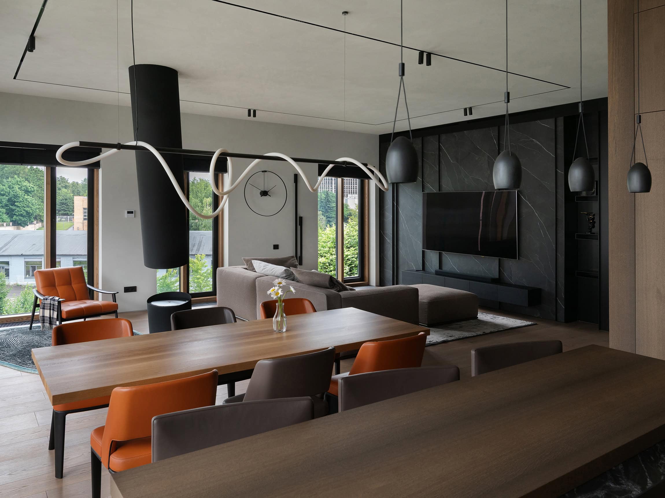
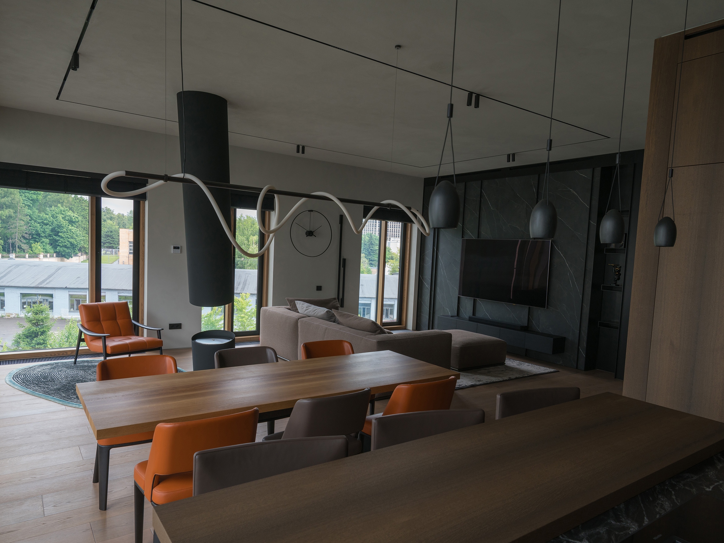
To keep objects from «flying apart» into the corners, this shot was taken with a less wide lens. This optically compressed the planes and kept the furniture proportions in check. In the B&W version, the white curved chandelier and the black pendants create a hard, linear contrast against the neutral gray ceiling. †
Here, as in many other frames, the client asked for some AI-generated «coziness»: a throw blanket and a vase of daisies. I should add, to get the edit right, this was shot as 4 frames at different exposures. They were blended manually.
📌Balance vs. Intervention 🎞️ The architect designed the space as a monolith. But life got in the way. By the time of the shoot, the client had bolted a large, round art object to the right side of the marble wall. It created a visual imbalance from any angle «pointed towards the kitchen». The left wall, with its built-in appliances, began to look flat and uninhabited.


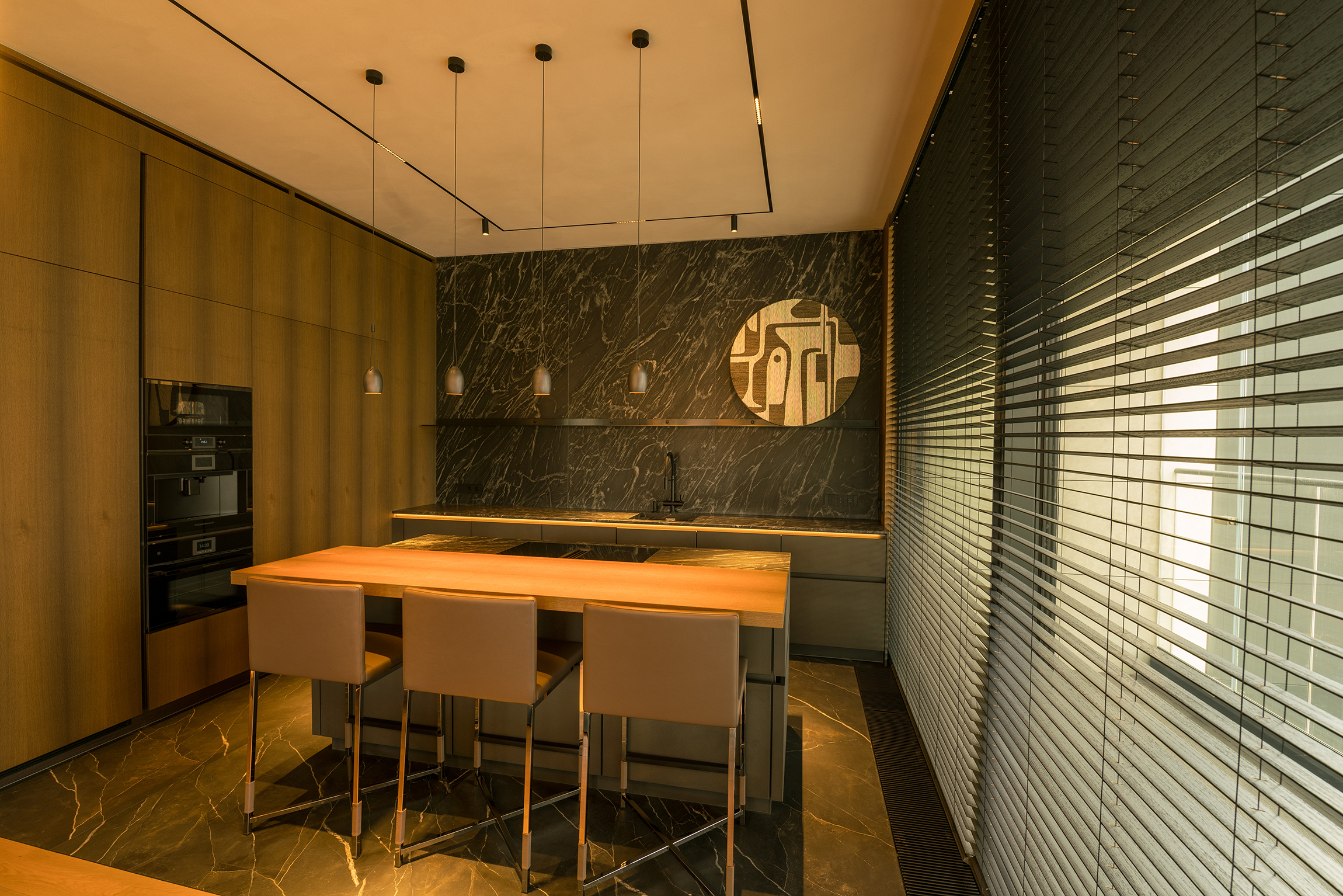
Three counterbalancing elements:
A vase with a graphic branch on the left edge of the island. It established a foreground focal point and introduced new movement into the frame. The branch, moving diagonally up and to the left, compensated for the painting’s off-center placement.
A linear set of five dark jars — placed strictly to the left of the painting. Their small-scale horizontal rhythm «stretched» the visual mass of the painting leftward and created a rhyme with the lines of the blinds and light fixtures.
A dispenser bottle worked as a visual «stepping stone».
The result: You have to think ahead on location. But there’s a difference between thinking and actually hauling around vases and branches for every possible scenario. That takes time, that adds labor. Experience in visual staging and AI tools solve the same problem much more cheaply.
Optical Compression 🎞️ The 50mm lens optically pulled the equidistant layers closer together. The final composition is laconic and needs no extra decor.


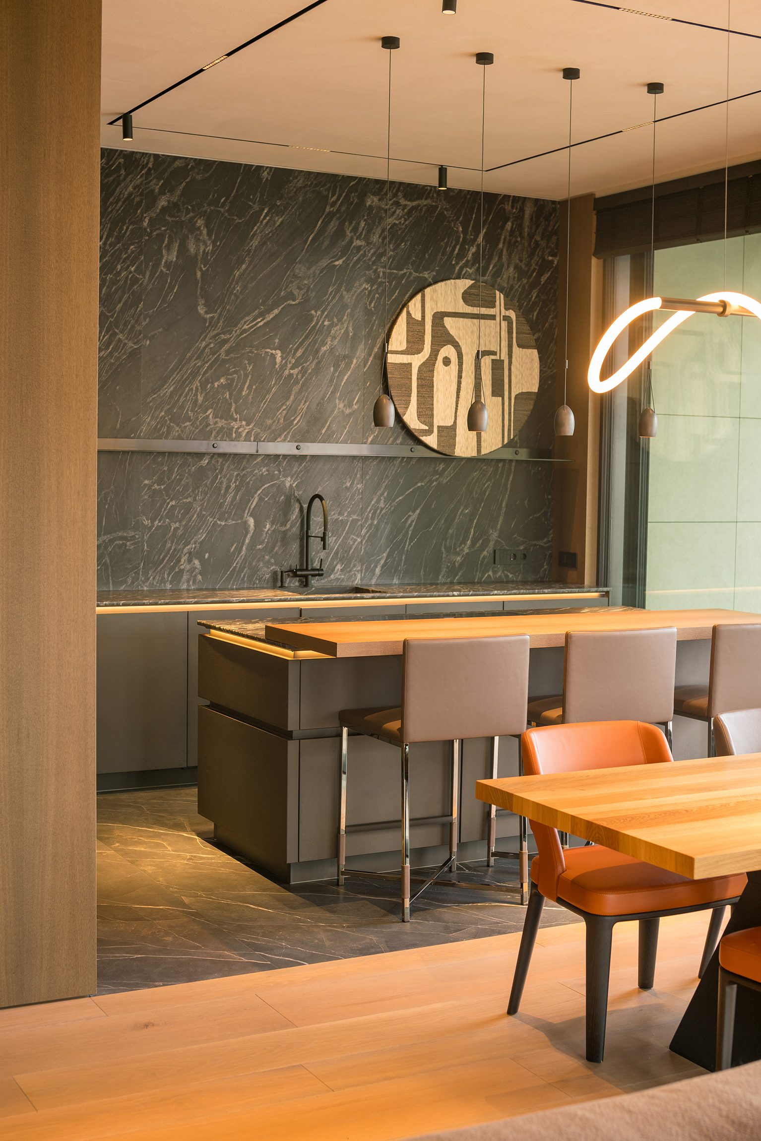
There were… let’s call them «reality issues» during the shoot). You can see them in the source file. A sofa was in the way, and a window frame on the right that you don’t even notice. That source file? I wasn’t happy with it. The thing is, when I took the shot, I knew exactly what I’d be able to pull from that rough ore.
In post-production, I pushed the spatial boundaries outwards and fixed the light, all while preserving the lens’s original geometry.
Removed the offending sofa from the foreground and extended the parquet flooring.
Generated a continuation of the window and a part of a chair leg — this gave it room to breathe.
Extended the wall plane to the left by 10–12% — got a powerful foreground wing out of it.
Slightly lifted the ceiling.
A file that was technically a reject turned into something you’d be happy to show in print.
📌Three Visual Blocks 🎞️The living-dining room — a see-through, flowing space.
The right flank is monolithic: the TV wall of black marble sets the tone. The left flank is all about light: panoramic glazing that opens onto the terrace fills the volume with natural light. In the center — architectural markers: the black, tilted column of the fireplace and the floating, graphic loop of the chandelier above the table. They tie the dining zone and the sofa group together.
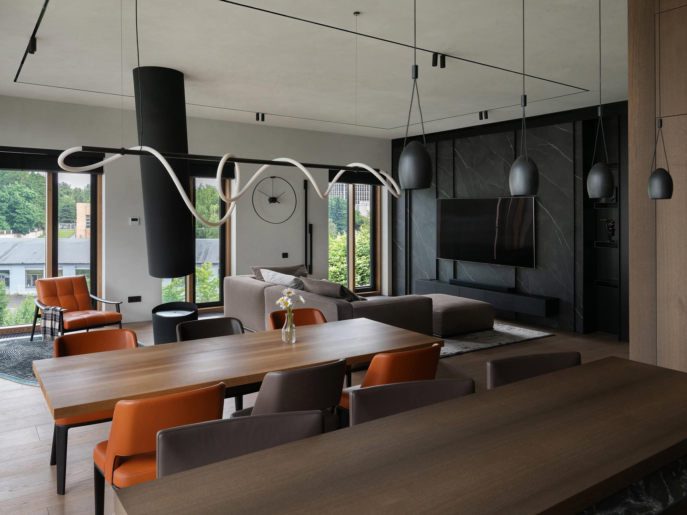
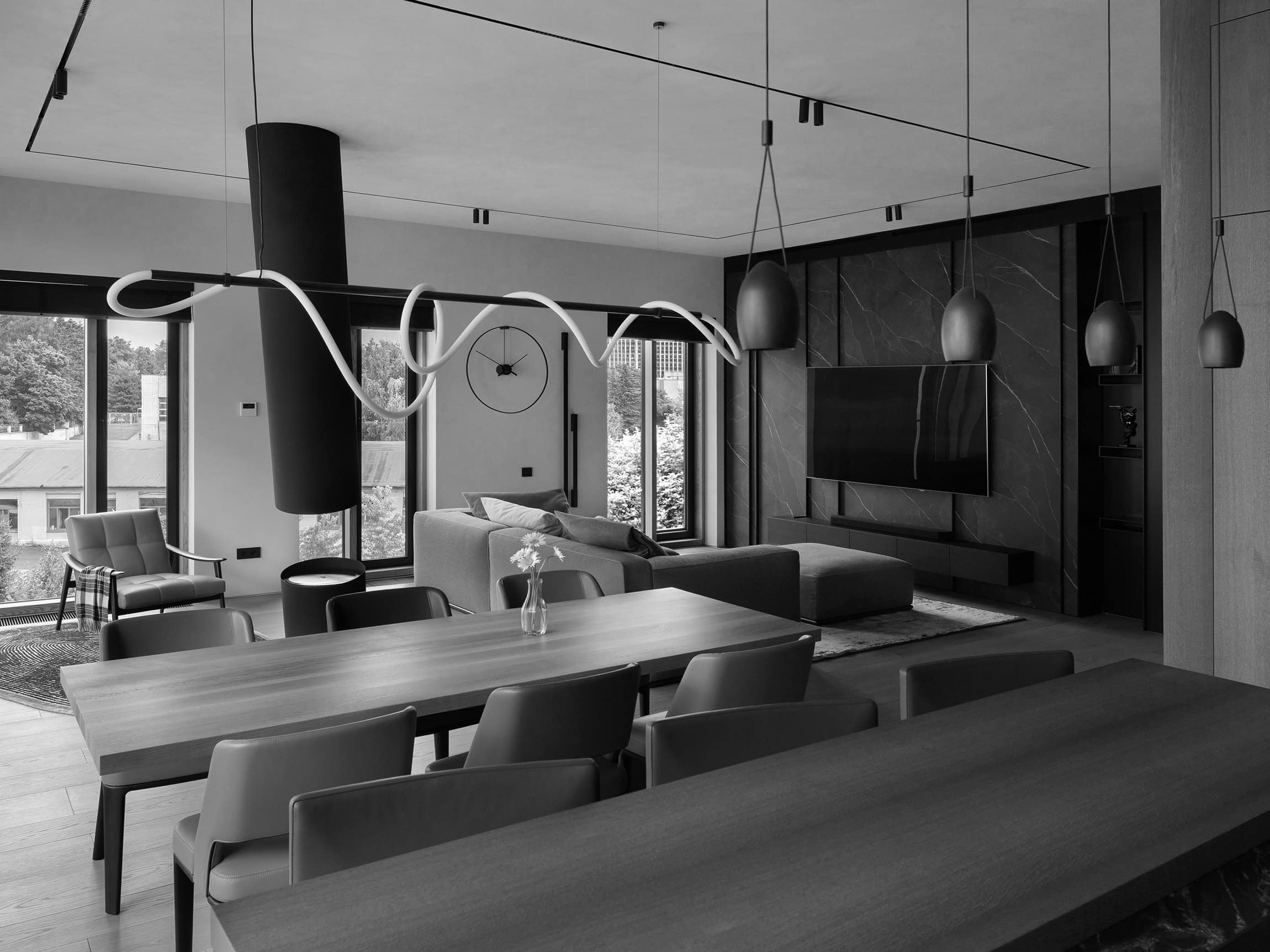
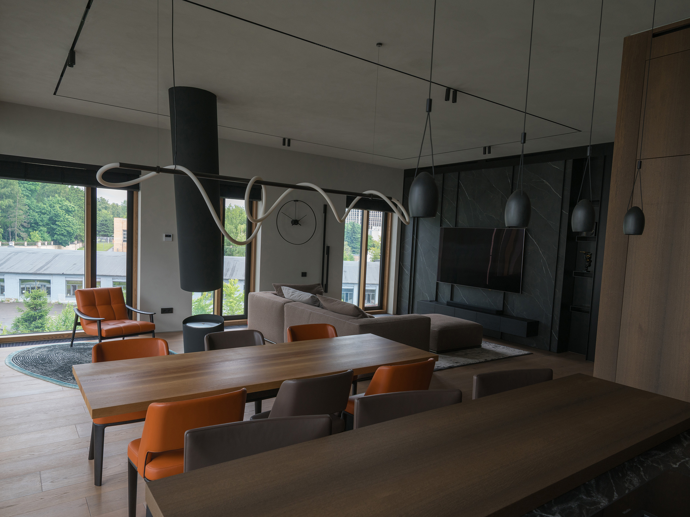
This large-scale shot — from the kitchen island all the way to the black marble TV wall and the panoramic windows — was taken with a regular lens, with no shift. Tilt the lens down to get the plane of the tables, and the interior immediately breaks. You get keystone distortion.
The need for a hard correction of that keystoning was baked into the plan from the start. Working towards the picture I had in my head, I gave the frame back its honest geometry.
The space in between opened up, and the living room stretched deeper, reclaiming its intended breadth. At the end, I added the final accents through styling.
📌Frontal Layering 🎞️ The dining group is built in layers. The light wood of the table and the foreground chairs overlay the dark mass of the kitchen island. Above it, the marble backsplash dominates. The thin, wavy cord of the neon chandelier breaks up the rigid rectangular grid and visually links the dining area with the round panel in the background. A special highlight of this shot — the space under the table.
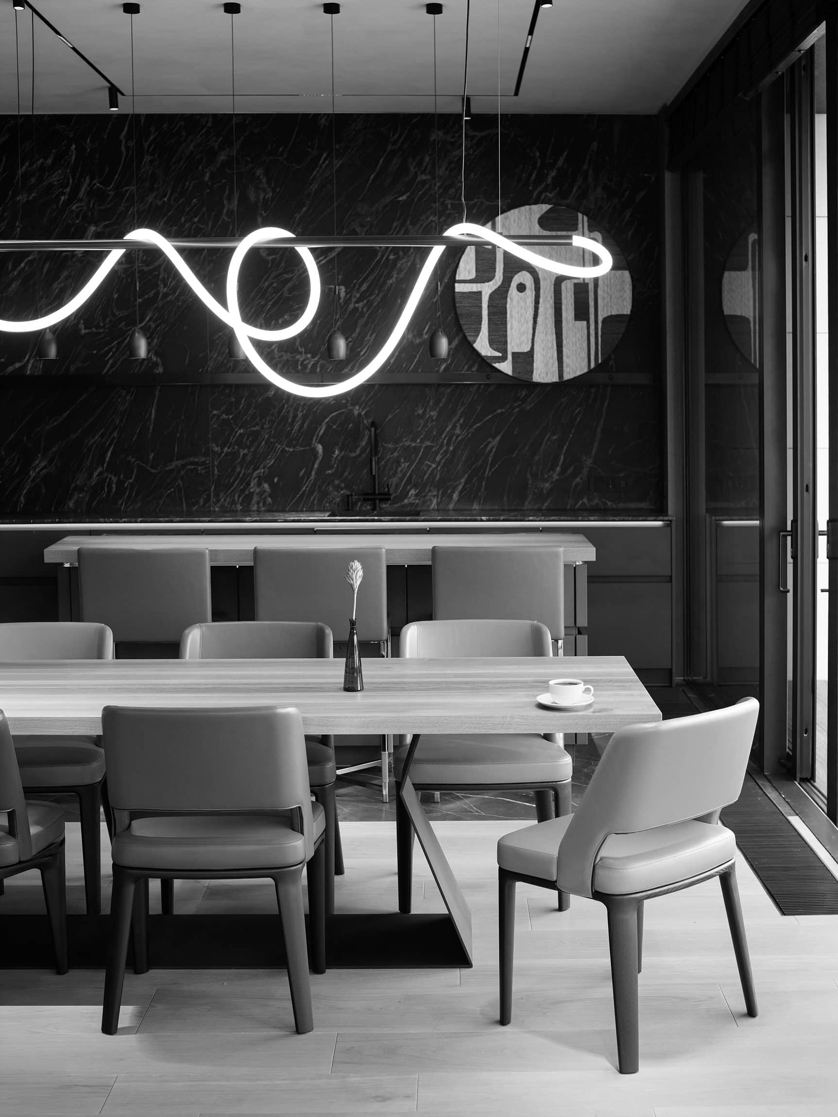

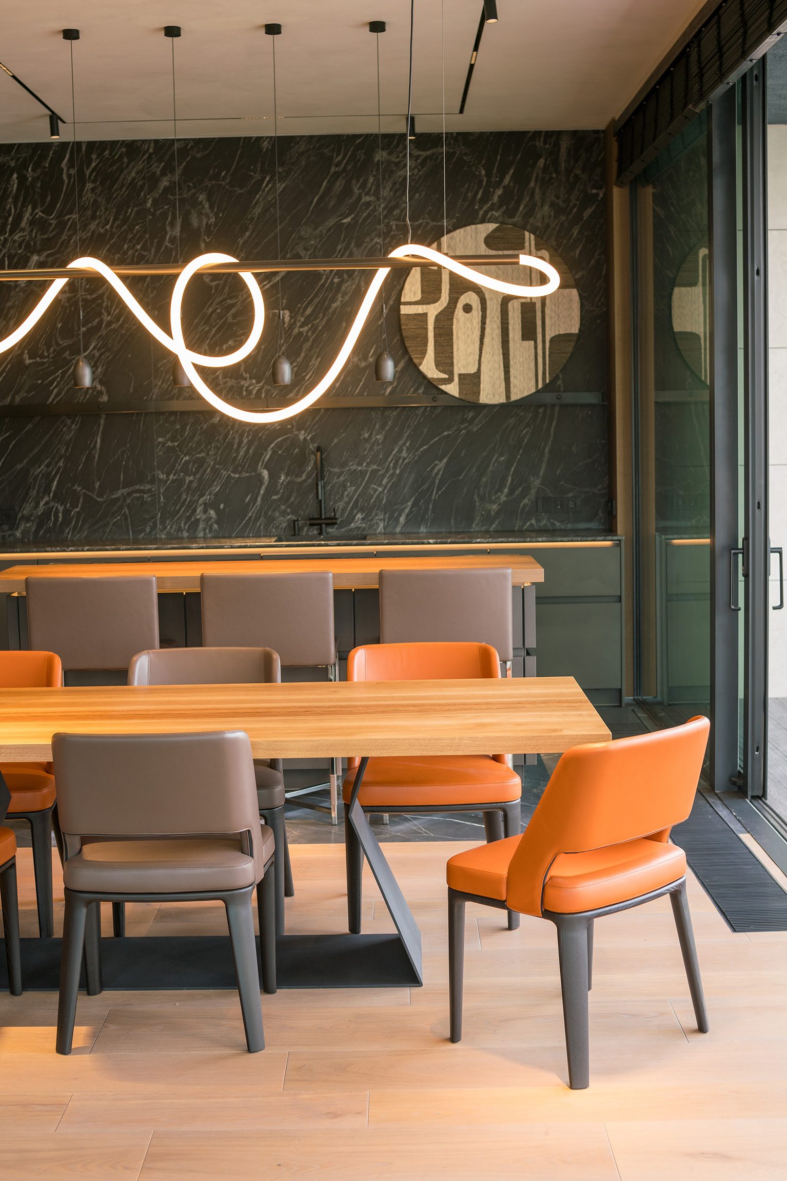
📌Shift Correction as a Minor Miracle🎞️ A correctly done shift correction still surprises me, even after all these years. It’s also a pleasure to work with shift glass. But right now, a camera with a super-sharp, high-megapixel sensor and a shift done in post is more profitable for me. It speeds up the shoot, and I take a tilt-shift kit on jobs less and less often.


With AI generations — it’s a whole different story. You need to pick the right spot. And over a VPN, let’s be honest, they run slow. Right now, we’re up against both the VPNs and the need to buy Photoshop through middlemen.
The color final made the materials look «expensive». The B&W version completely changed the shot — it helped you disconnect from the furniture and perceive the space as volume. The transformations done in post were already built into the shooting process.
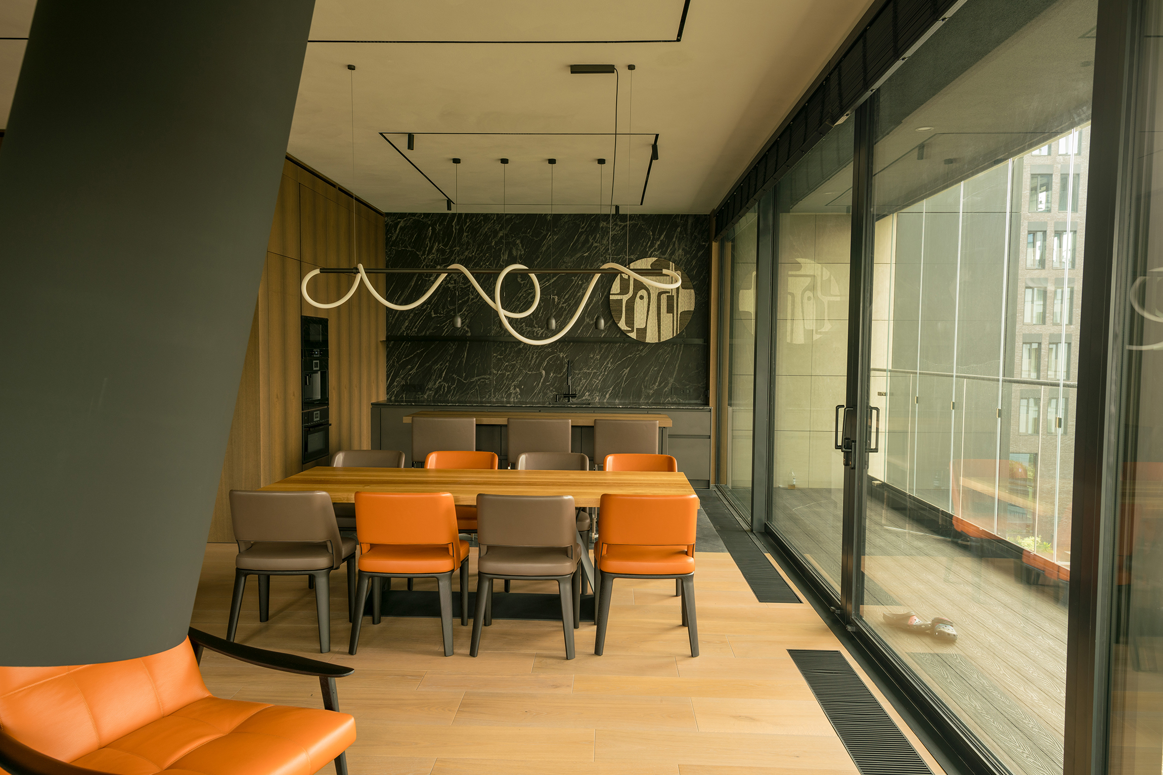
The straightened verticals of the sliding glass doors on the right turned into a powerful rhythmic pattern — an alternation of black metal profiles and gray reflections. In B&W, you see it more clearly.
The ceiling tracks became absolute black, like surgical incisions on the white ceiling. They formed a perfect perspective grid that pulls your eye right down the center — towards the floating neon wave.
In color. The bright orange-terracotta leather of the foreground armchair and the dining chairs is an aggressive focal point. Because of how our vision works, the lower-left corner and the right flank of the table were «shouting». The color was fragmenting the frame. Harmoniously, yes, but…
In B&W. Those terracotta planes melted into a noble, mid-gray gradient. The armchair and chairs no longer fight with the graphite marble and the veneer. The eye now travels through the shot. Calmly.
The little vase of dried flowers and the teacup. Due to the difference in luminosity — light glass and dry flower heads against the dark marble backsplash — they literally «lit up» and formed a sharp, contrasting silhouette rhythm.
The soft armchair, the checkered blanket. In monochrome, the pattern is more graphic. The textile became a complex geometric pattern that fell right into the rhythm of the frame.
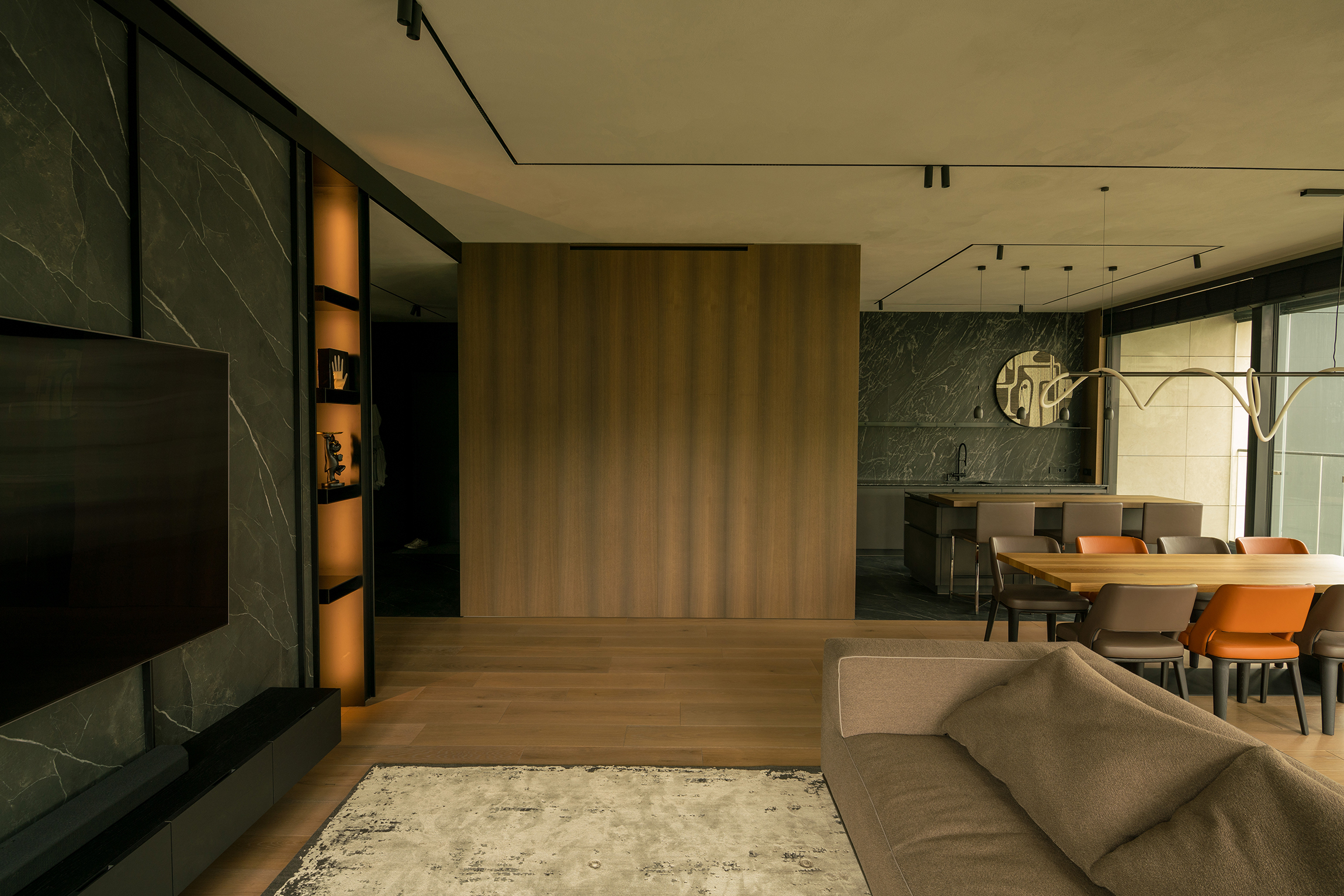
📌The Painting on Oak Veneer as a Compromise 🎞️ Even the least attentive viewer will notice the difference between the final and the source: in the center, on the veneered wall, an abstract painting has appeared. It wasn’t there on location — the project’s author asked to add the canvas in post.


Why? The project’s author thinks in categories of interior dressing and the balance of client perception.
A fear of emptiness. The canvas was meant to be an «anchor» that would pull the center of the frame together. A color rhyme. In the color finish, you can see it: the palette is perfectly matched. The brushstrokes on the canvas rhyme with the terracotta chairs, the graphite smudges with the marble in the TV zone, the light areas with the rug.
But let’s set aside the commercial decor and look at the shot from the perspective of serious architectural photography. Let’s try.
In the source file, the veneered wall reads as a powerful architectural element — a tectonic pylon, a monolith. It gives the frame monumentality and a sense of expense. The appearance of the canvas shrinks the scale. The wall stopped being self-sufficient. The monolith vanished.
There’s a noble vertical rhythm built into the interior — the strips of wood veneer. The painting cuts across this graphic, creating unnecessary visual noise in the calmest zone.
Look at how the masses are distributed in B&W. On the left, a heavy, dark block of the TV zone. On the right, the fragmented but equally dark depth of the kitchen. Down the center, the light patch of the rug. In the source file, the veneered wall worked as an ideal mid-gray mediator. An island of calm where the eye could rest between the two contrasting blocks on the left and right.
So. As a commercial compromise for a publication — the decision is fair. For the average viewer, the interior became more readable. The author’s job is to sell coziness, and the painting helps with that.
But from a fine-art standpoint, the canvas here is superfluous. Noble veneer is self-sufficient and doesn’t need a decorative cover-up. The painting turned a strong architectural space into a «beautiful, lived-in living room».
📌Decor in Color and B&W 🎞️ Here you have three states of the same space: the source file, the color final with the vase by the window, and the black-and-white final WITHOUT the vase. I’m using this example to show why decor that works in color can be totally wrong for B&W.
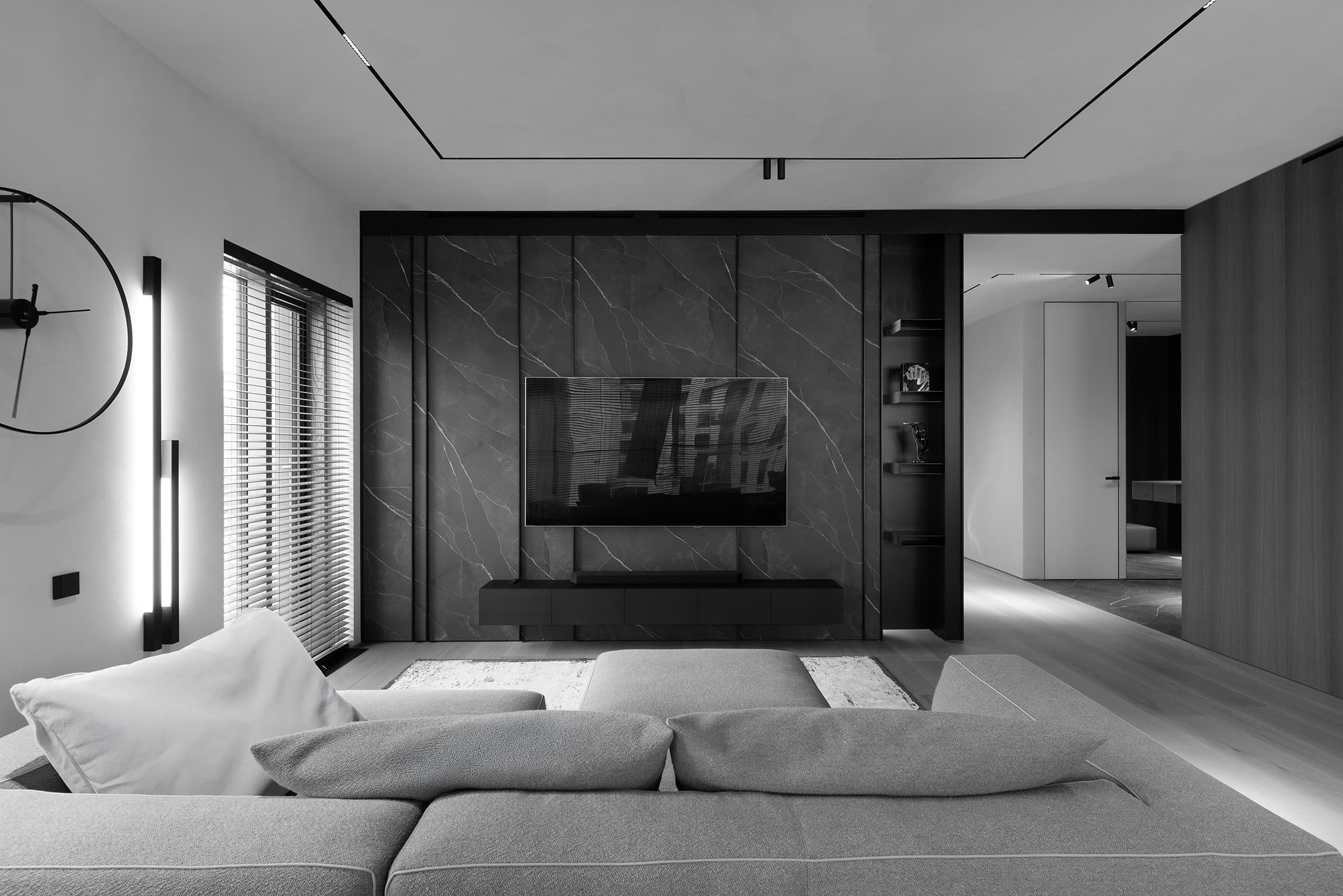

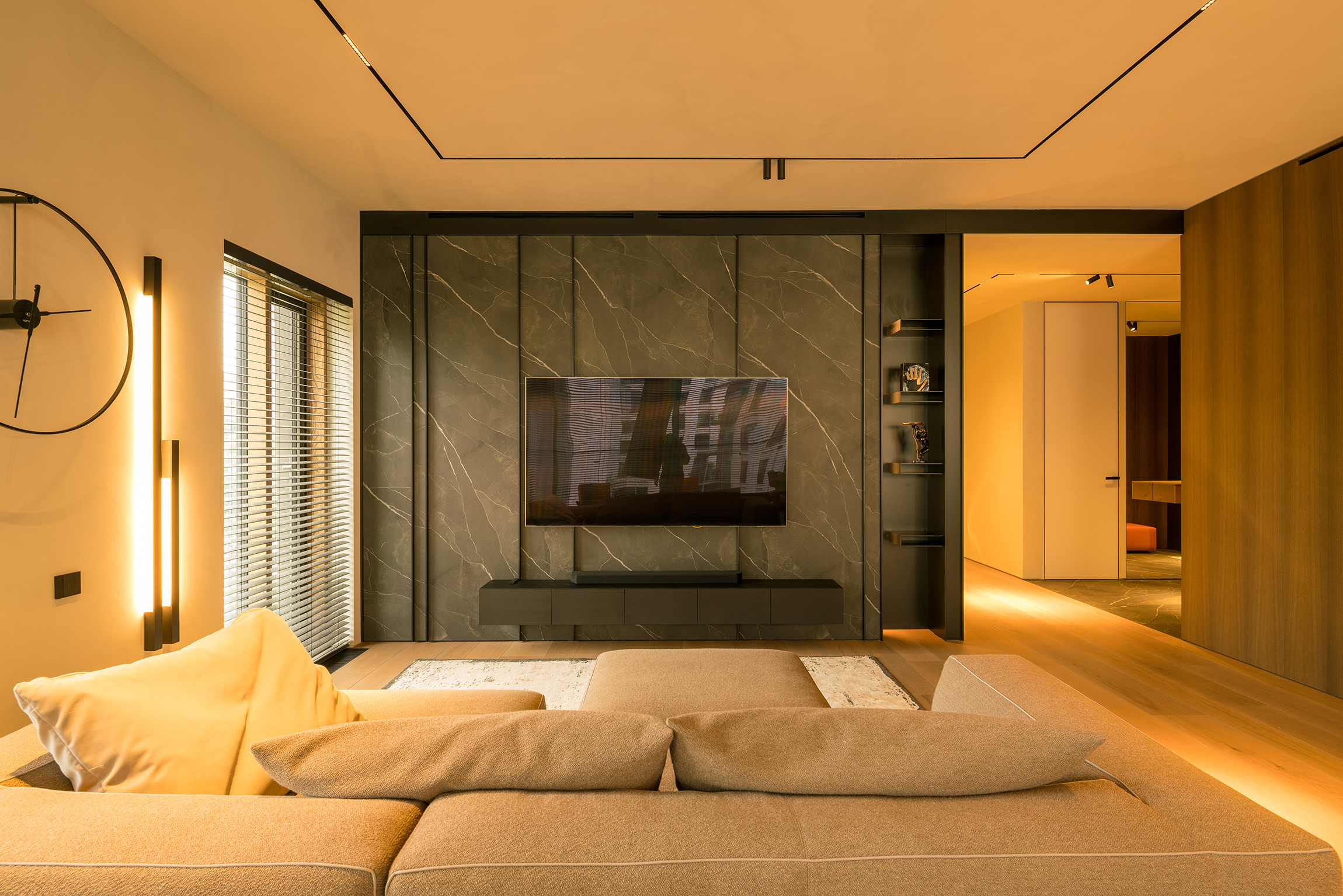
On the right — a deep view into the warm-toned entryway. There’s diffused light burning there, a piece of the veneered wall is visible. An active warm spot.
If you leave the left side by the window empty, the cold marble and the white wall will fail in terms of warmth. The frame visually «tips» to the right. The vase with dried flowers brought a necessary warm color accent into the left side. The golden twigs rhymed with the warm light from the entryway and the accent lighting.
In black and white, the color rhyme no longer works — only geometry remains. And the vase instantly turns into visual garbage. The left side in B&W without the vase:
The vertical blinds create a strict, rhythmic graphic pattern.
The stick light on the wall and the round clock set up a pure geometry.
📌Backlight 🎞️ On the surface, this shot seems deceptively simple and natural. In reality, this is a case where I had to use two technical tricks, and then heavily rework the image in post.
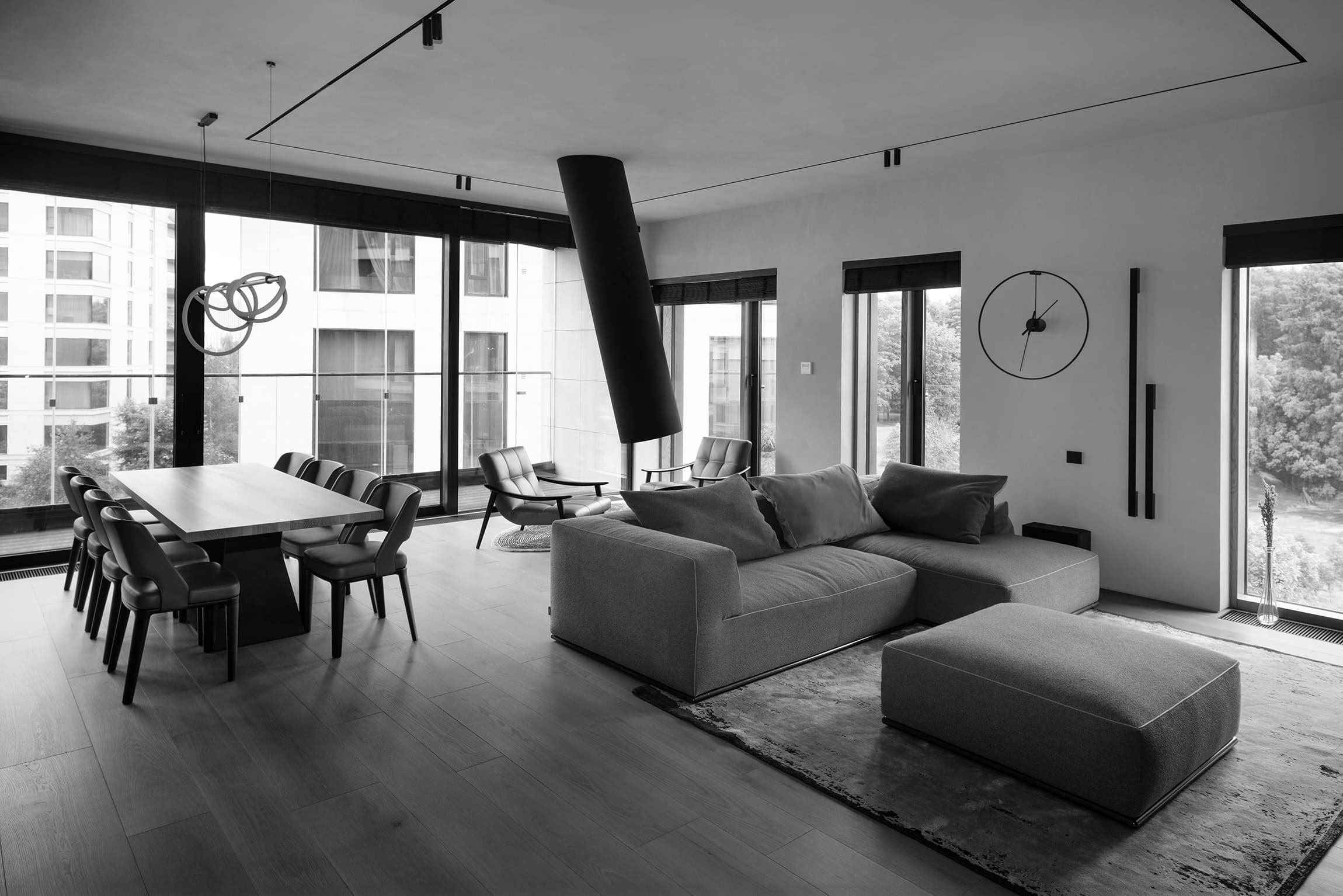

The main challenge of this angle — backlight. The floor-to-ceiling panoramic windows are sitting directly behind the dining group. HDR here would have resulted in a gray, «muddy» mess, and a classic Flambient approach à la Nathan Cool would have turned the ceiling into glowing plastic and killed the dynamics of the light.
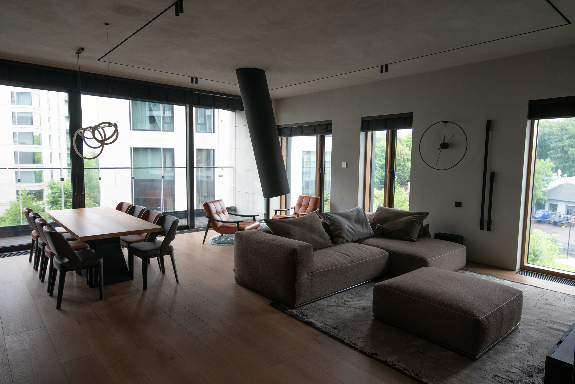
I took a different route: I hit the dining zone with a flash from behind the camera — this gave me readable details and textures. I preserved the overall physics of the daylight.
The backlight from the panoramic windows was burning out the lacquered surface of the wooden table. I sliced off that glare with a polarizing filter. In the final, we can see the wood texture.
Look at the ceiling and floor in the color final — the light from the windows on the left flows softly and naturally through the room, fading towards the right wall. The volume of the sofa is revealed, the texture of the rug, and the micro-cement ceiling got a true matte look. The tilted black chimney of the fireplace became the backbone that holds the panorama together.
Beyond the optical work on location, there was some serious surgical work in post. In the source file, there’s a tacky *kolkhoz* house sticking out of the left panoramic window. In post, I liquidated this «echo of war» (c).
Rehabilitating the Vase. Remember, in the frontal shot of the TV zone, I pasted a vase with dried flowers by the window in the color version, but erased it in the B&W final? In this wide shot, I left it in both versions. In color, the golden twigs on the right became a color callback — they balanced out the warm, reddish leather of the chairs on the left side of the frame. In B&W, the scale changed for this wide shot: the left side is overloaded with the graphics of frames and chair legs; an empty right corner would have looked like a hole.
📌A Sweeping Diagonal 🎞️ This angle ties three very different elements into one sweeping diagonal. The eye-line leads from the corner of the sofa in the foreground, slides past the central wall with the clock, and anchors on the floating fireplace and the orange armchairs by the far window. The dark marble on the right acts as a visual barrier.
The wall fragment between the windows is a point of rest: the clock and the sconce form a graphic knot. I subordinated the rest of the frame’s geometry to this feeling. The windows with blinds work as a strict framing for this zone.


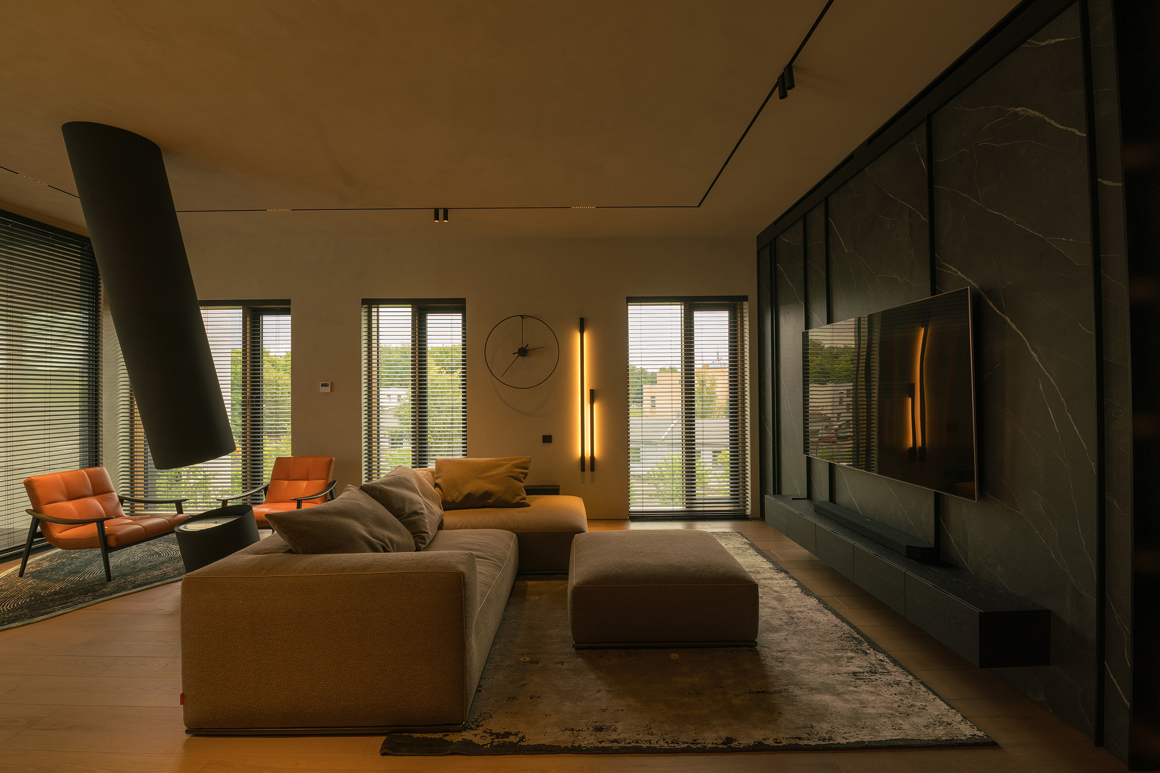
The shot, as I saw it in my head, demanded retouching, an extended canvas, and of course, color grading.
Two finishes. The color version unpacks this architectural complexity into readable layers: now the sofa textile harmonizes with the natural greenery outside the window.
The black-and-white final did its usual job of cleaning the form of color noise, but with a specific zonal correction during the B&W conversion, using the yellow channel. Targeted control over this spectrum allowed me to separate warm tones that were close in density — wood, leather, fabric. The former patches of light turned into deep, velvety grays. †
📌Zoning Without Walls 🎞️ The huge studio is zoned without a single solid partition: through furniture arrangement, a shift in textures (light plaster — dark marble), and see-through optical axes.
The central placement of the floating pipe emphasizes the fireplace as the core. The flue pipe is shown in its entirety, from ceiling to floor.

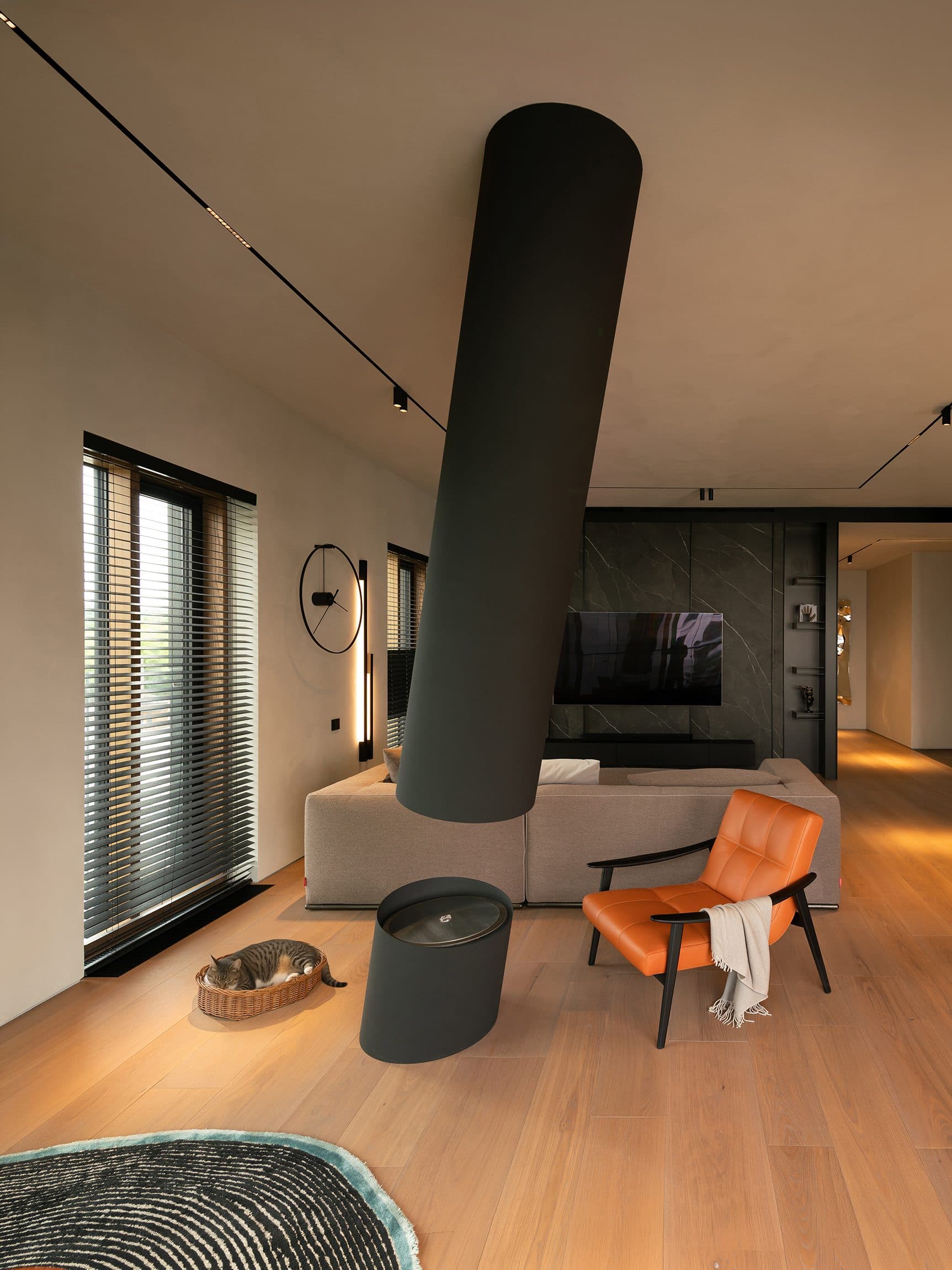
Your gaze doesn’t hit a wall. The space pulls you deeper — from the rug, past the fireplace, into the lit perspective of the corridor. The shot is interesting to explore, to decode the layers. A sleeping cat and a throw blanket instantly bring the strict architectural graphics to life.
The viewer «tries on» the comfort. The picture becomes a real, desirable home.
📌Reality and Reflection 🎞️ The photograph reveals the delicacy of the design. The panoramic glazing of the terrace works for the interior, optically complicating the room.

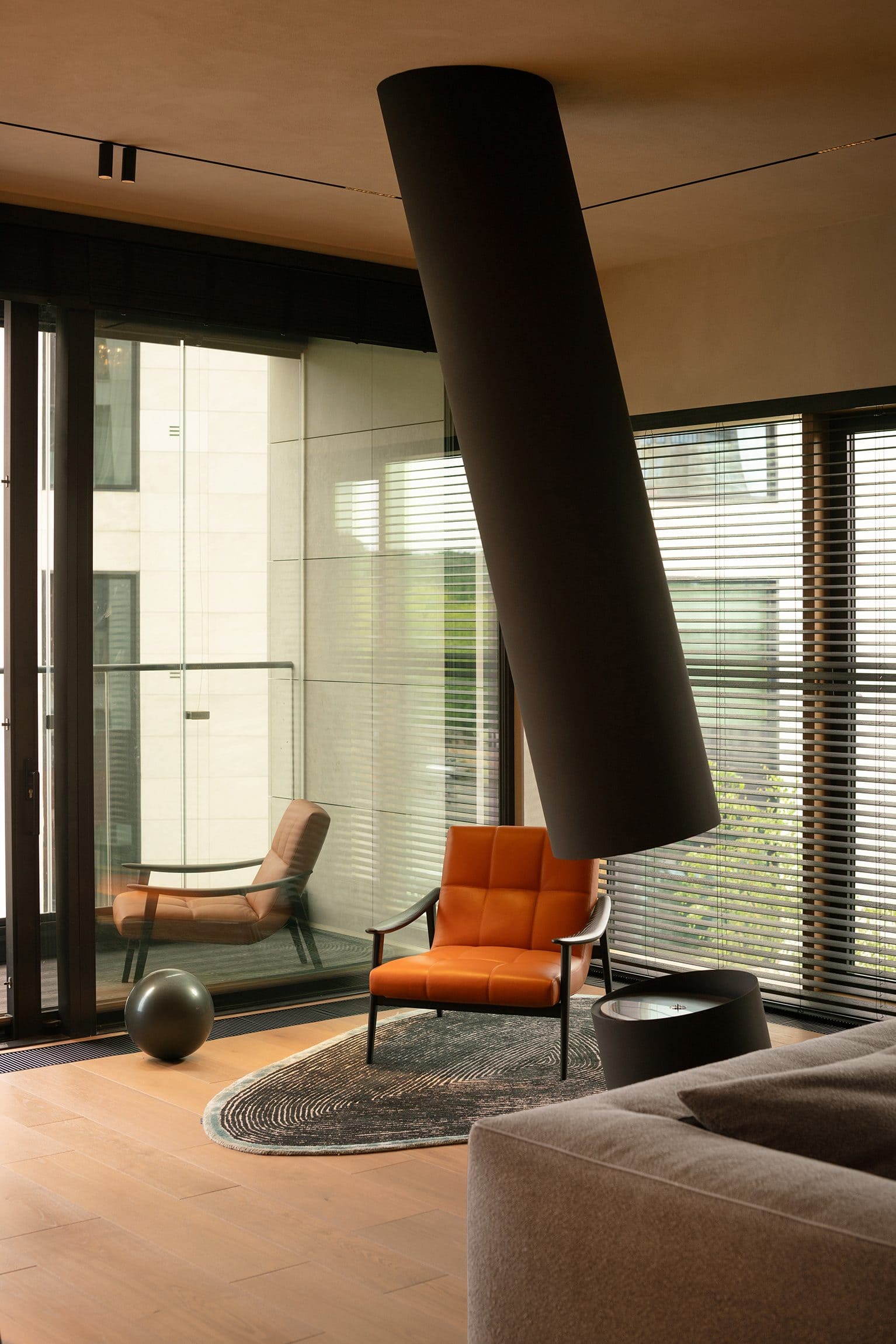
The mirror doubling of the orange armchair and the blinds in the glass on the left creates the illusion of double the volume. This holds our attention, making us figure out where reality is and where the reflection is. The back of the sofa in the foreground on the right is a kind of wing.
It creates the feeling that I, myself, am looking into a secluded lounge area with a fireplace.
In the black-and-white version, this linear rhythm is revealed with maximum sharpness. †
📌Two Focal Points in One Frame 🎞️ Here, the dining group and the fireplace zone are brought together into a single narrative. The wooden tabletop sets a diagonal vector, pulling the eye deep into the room towards the cone of the fireplace and a pair of armchairs. The compositional paradox hinges on a clash of two dominant features: the sinuous, glowing strand of neon and the massive cylinder of the flue pipe cut sharply into the space from above. The floor-to-ceiling windows with their lowered slats serve as a coordinate grid.

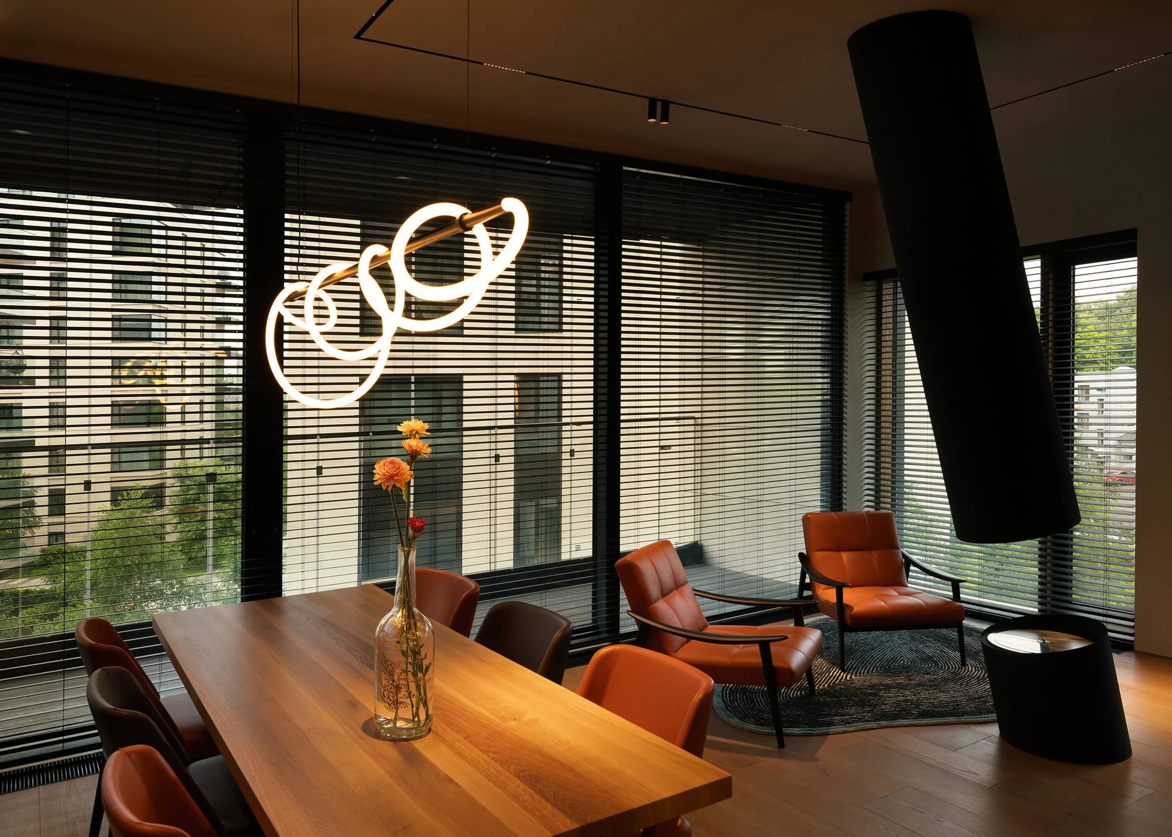
In color, the reddish leather accents of the armchairs and chairs are distributed across the frame in a stable triangle. The brightly burning neon loop creates a localized warm core on the wood of the table, while the walls and ceiling are completely cleaned of a dirty orange cast and taken into a neutral zone. A glass vase of flowers was added: daylight refracts through the glass and water, casting a soft shadow on the parquet. The pinkish-red flowers break up the strictness of the engineering graphics.
📌Monochrome: The Purification of Form 🎞️ In the central pier, the thin black circle of the clock rhymes with the vertical line of the sconce. The plane of the gray sofa in the foreground sets a cozy base. The windows on either side, with lowered blinds, are woven into the background rhythm, metering the daylight.


In monochrome, this fragment loses its domestic context.
The matte white glow of the sconce slices through the gray wall, and the light fixture itself becomes an independent object. The disappearance of color laid bare the rhythm of the blind slats; they became a graphic framing. †
📌Where B&W Is Powerless 🎞️ The massive wooden tabletop and the chairs in the foreground work as a compositional wing. The eye travels under the curve of the neon light and anchors at the focal point — the orange armchair. The right side is held in check by the tilted cylinder of the fireplace. Daylight cuts through the blinds, drawing out the textures of the details.


In B&W, the sinuous white loop of the neon light dominates — it looks like a futuristic streak of light around the dark volume of the fireplace. Zonal correction finished the job of separating the planes that the light had started.
📌Wrapping Up the Immersion. We started on the open terrace. This closing pair of shots sums up the entire spatial narrative. With the portal doors open, the leading lines of the exterior deck boards align directly with the rhythm of the parquet, uniting the outdoor armchair and the dining group. However, despite the identical planning logic, these two angles reveal a fundamentally different compositional interplay of color, geometry, and optics.
📌Optical Compression 🎞️ Here is an example of where monochrome turns out to be powerless, and the usual division of a portfolio into «commercial» and «gallery» work breaks down.


Here I used a longer, tighter focal length: the camera is further out on the terrace and optically «pulls» the interior toward the viewer. The space compresses, the planes pack together, and the kitchen island, wooden table, and chairs line up in a tight row. In such a compressed space, converting to B&W glues the planes, pressed together, into a single gray mass. Color is physically necessary to separate the layers. Only in color does the transition become visible: how the cool, daylight-flooded deck board gives way to the wood of the domestic parquet and the deep, enveloping tone of the veneer.


📌Erasing the Temperature Barrier 🎞️ In this closing scene, monochrome makes a powerful statement. I switched to a wider angle, the camera moves deeper to the left. The lines of the exterior decking rush into the distance, the glazing portal opens up like a massive frame, and the facade slabs of the exterior thrust the large-scale junction of volumes into the foreground. The wide-angle geometry itself gives such strong volume and separation of objects into planes that the composition no longer needs color cues. The black-and-white final erases the temperature barrier between the outdoor light and the interior.
The disappearance of color turns the boundaries of the glazing and the window planes into a single rhythm, running from the left side of the frame all the way to the painting deep in the corridor. This picture conveys the volume of the room.
Footnotes
† Black and White in Architectural Photography. In the global practice of architectural photography, the black-and-white mode is a method of spatial analysis. The human brain reads three-dimensional volume and depth through differences in luminosity, through chiaroscuro. B&W cuts out the visual noise; the viewer stops evaluating the play of finishing materials and starts seeing the tectonics of the space: the symmetry of axes, the Suprematist graphics of the light fixtures, the rhythm of the ceiling tracks, and the volumes. This is the mode in which an interior becomes a timeless architectural drawing.
Ilya Makotinsky. A hereditary architect, graduate of the Moscow Architectural Institute (MARCHI). Since 2002, his studio has been designing private country houses, commercial interiors (including the «Wine Bazaar» restaurants and Lexus and Toyota dealerships), and apartments in Moscow. He is a member of the «Artbalkon» community, which unites industry experts. His work is regularly published in major interior design media such as Salon.ru, «Krasivye Doma» (Beautiful Houses), «Krasivye Kvartiry» (Beautiful Apartments), and «Derevyannye Doma» (Wooden Houses). Website: https://mim-design.ru/
Joel Tjintjelaar. A Dutch photographer, acknowledged as a master of black-and-white architectural photography with many years of practice. He is known for his method of tonal processing and his signature approach to long exposures. He scientifically grounded why monochrome reveals form and structure more effectively: the human brain reads volume through differences in luminosity, while color is merely a distraction. Author of the book «From Basics to Fine Art» and creator of the BW Artisan Pro system.
Julius Shulman (1910–2009). A legendary American architectural photographer. It was his black-and-white shots of Californian modernist homes (including the famous «Fallingwater» and Case Study House #22) that shaped the visual canon of mid-20th-century architecture. He worked predominantly in wide-angle and monochrome, erasing temporal markers and turning buildings into timeless sculptural objects.
Ezra Stoller (1915–2004). An American architectural photographer, a colleague and contemporary of Shulman. His shots of modernist skyscrapers and industrial buildings (including the works of Frank Lloyd Wright) are distinguished by rigid geometricity and a sculptural rendering of volume. Together with Shulman, he laid the foundation for the «classic American technique of large-scale modernist documentation».
Nathan Cool. A contemporary American interior photographer, who popularized the Flambient technique (see below) in real estate and interior photography. He is the author of several practical guides on real estate photography, detailing work with flash and post-processing.

❤️ This material started coming together in 2006. Over 20 years, the text has become like a palimpsest — an ancient parchment where new records were written over old ones. From working recipes — to dialogues, from dialogues — to a philosophy of space. In these traces of development are the traces of our time, of rapid shifts in market demands, and an opportunity for the reader to map this onto themselves.
Palimpsest began as my internal dialogues during shoots and scattered notes, which, over time, found their places among 14 chapters and 240,000 characters. That’s not a lot. You can read it all in an hour, or two if you’re really digging in. And then you can skip school.
I get it: you could pull out blocks «for the right audience» and create separate pages. But that would break my main goal — to show the reader moments that are just slightly outside their area of interest. The things that are right next door, but still outside. That’s exactly what helps those who are steeped in this industry understand each other better and collaborate more effectively.
1. Origins and Philosophy | 2. Meanings and Tasks. Who We Shoot For | 3. Business, Price, and Partnership | 4. Organizing the Process and the Brief | 5. Decor and Bringing Interiors to Life | 6. Composition of Decor and Ghosts | 7. Composition and Angles | 8. Shooting Technique | 9. Optics (Selection and Tests) | 10. Tilt-Shift (Meaning and Substitutes) | 11. Cameras and Filters | 12. Light and Video | 13. Post-Processing | 14. Career and Future
Who This Is All For — and Why Even Read It, and Who Shouldn’t Bother ↴
For young photographers, there are plenty of moments in here that are uninteresting, irrelevant. For instance, the stuff about formal briefs from big clients. Yes, it’s a *tyagomotina* — a real slog — but as someone who is first and foremost an «interior + architectural photographer«, I’m obligated to show you the point any pro eventually arrives at — and what’s waiting for you there.
For clients, this text lays out the behind-the-scenes kitchen. Of course, maybe one in a hundred will actually read it. After all, everyone wants everything fast and for the price of a tax-free half-day. These desires for a quick win go all the way to the top of the food chain — a quick war, a quick love.
But if you want to buy a good piece of fruit or meat at a market — not at a store where everything is «so-so» — you have to take a good look at the goods. Maybe even touch them.
 1. Origins and Philosophy of the Genre
How William Henry Fox Talbot managed to stop light in his library in the 1840s — and why that event still echoes in every shot you take.
Why a modern photographer needs to know what was happening in Glasgow in 1868 — when the authorities commissioned photos of dilapidated buildings before demolition.
What Frederick Evans saw in an interior at the start of the 20th century — not just walls, but an almost mystical play of light and shadow.
How a pro’s work differs from a beautiful phone shot — and why the second option is often only cheaper at first glance.
Can a random person shoot better than an experienced photographer — the Helmut Newton experiment where models triggered the shutter themselves.
What’s more important for success — a portfolio or an arts education — and why the client couldn’t care less about your diplomas.
How the Japanese concept of ‘Ma’ (emptiness) teaches you to photograph not things, but the space between them.
Why an architect looks at a shot and immediately knows if they’re looking at the work of a pro or an amateur.
 2. Meanings and Tasks. Who We Shoot For
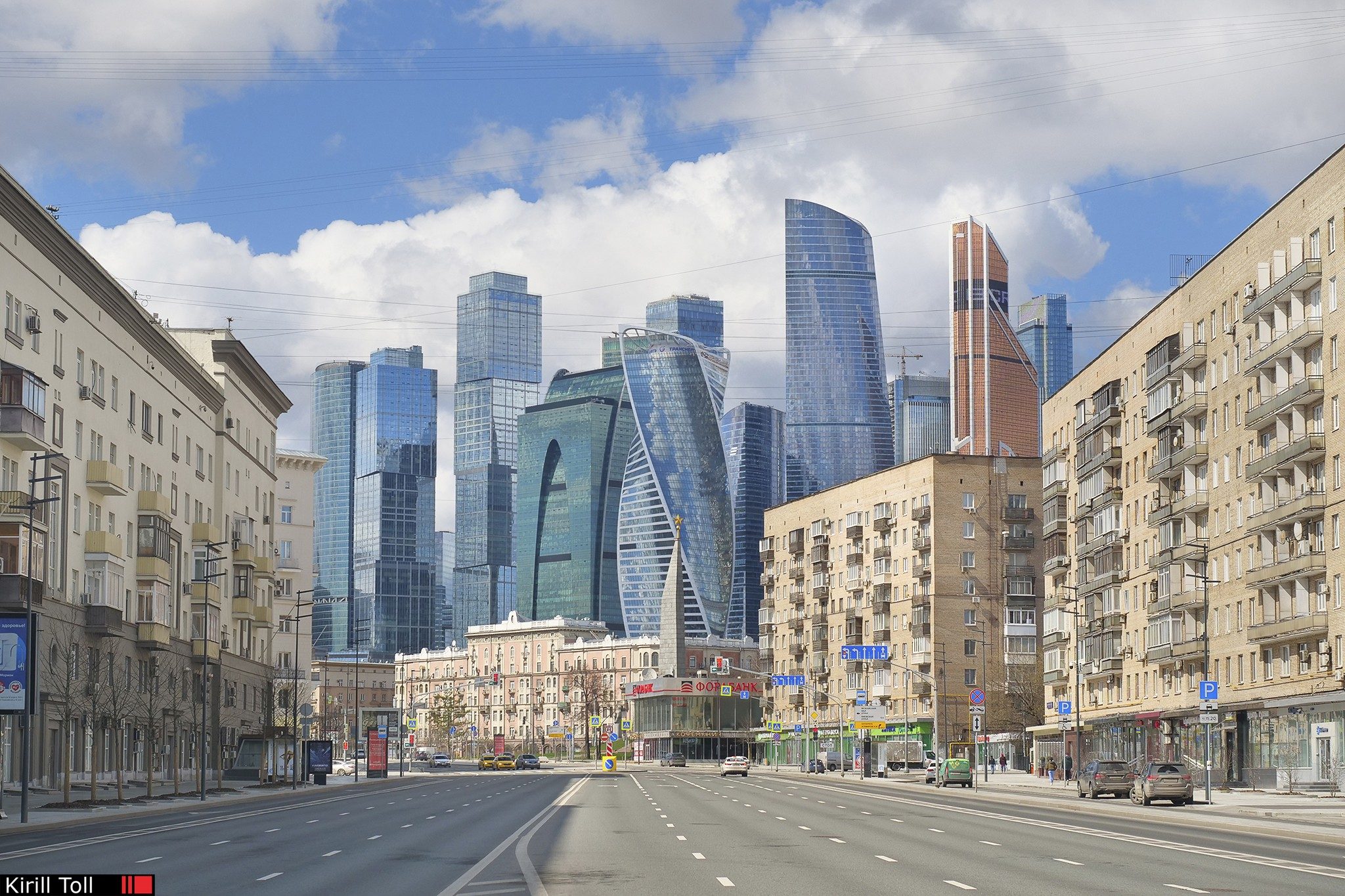
Why the shooting method doesn’t depend on the room’s label — bathroom, kitchen, basement, bedroom: the question isn’t where you are, but why you walked in with a camera.
How interior photography differs from architectural photography in the global market — in English, there are two different words for it, and mixing them up means mispositioning yourself.
How to shoot for an architect, a hotel, and a realtor — three clients, three tasks, three truths. One wants a document, the second wants a fairy tale, the third wants a sales weapon.
What benefit does an architect get from working with a professional photographer — this isn’t about pretty pictures for a portfolio. It’s about saving time, money, and nerves on rework.
What an architect dreams of when looking at good photographs — that someday humanity will get around to rebuilding not just houses, but clouds, and even time itself.
What is the «longevity» of an architectural photograph — why some shots become dated within a year, while others look fresher ten years on than the day they were taken.
Why does a realtor need a photographer if they have a good phone — it’s not about the camera. It’s that the right photos work as a filter: they screen out those who won’t buy and pull in those who are ready.
How they shoot real estate in the USA and Japan — Americans relight every corner, Japanese barely stage any decor. And each approach has its reasons.
Why don’t the Japanese put out a vase for beauty — because they have different ideas about what’s important when selling an apartment. Spoiler: the blueprints can be more important than the photos.
What an interior photographer must never do — there is one cardinal sin, and it’s not a missed deadline. It’s kept quiet in courses, but you pay for it with your reputation.
Why, in Moscow and Petersburg, an architectural photographer also has to be a cleaner — because even the most brilliant shot can be ruined by people you wouldn’t suspect. Meet Mr. Wires.
 3. Business, Price, and Partnership
Why a price «starting at 40 bucks an apartment» is a catastrophe — the photographer named their price before seeing the place. Here’s how that ends for the client and for them.
Can a client become a co-author of the shoot — this isn’t about the client pointing at a screen. It’s about something else. Rare, but that’s when the best projects are born.
What a photographer expects from a client as a partner — not free coffee, not a warm welcome. Sometimes — six cars blocking the facade and a guard ready to move them on command.
How we shot a facade in central Moscow when the perfect angle was jammed with parked cars — retouching didn’t help, a drone was banned. That’s when an adventurous but impeccably logical idea was born.
How and why to participate in tenders for shooting large-scale projects — three traps waiting for the photographer inside. And why, sometimes, the best professional move is to politely decline.
 4. Organizing the Process and the Brief

How to start a dialogue with a photographer to understand each other in half a word — not with «how much do photos cost». But with questions many clients are afraid to ask, and they shouldn’t be.
If writing a brief is hard — what to do — two paths. One through the photographer’s experience, the other through a preliminary site visit. Each has its pros and cons.
How to write a brief correctly — a checklist of five critical points — zoning, people in the frame, time of day, visual references, format. Everything you need to avoid getting something you didn’t want.
Why clients ask for «as many photos as possible» and how to react — it’s the fear of missing something. But the truth is, a presentation is a story, not a warehouse of duplicates where the real shot gets lost.
How many photos are needed for an architect, a realtor, a shopping mall, and a hotel — from a couple of shots to a hundred and fifty. And why sometimes less is more.
Why an architectural photographer needs a fisheye — a lens used once every two or three shoots, but for that one shot, it’s irreplaceable.
What the process of creating commercial photographs actually consists of — three stages the client often doesn’t suspect. And each one affects the final price.
 5. Decor and Bringing Interiors to Life

How to make an interior «come alive» in a photo — two paths: the fast digital one and the slow classic one. One costs a couple cups of coffee, the other requires attention to detail.
Is staging necessary for an architect’s portfolio shoot — there are different rules here. The photographer is a conduit for someone else’s vision. Decor here is a touch, not a method.
How critical is staging a property before a sales shoot — numbers from the US: staged homes sell 68-85% better. As for Russia — check it out for yourself.
How to present a completely empty space — concrete walls, not a single item. Is there any point in shooting this? Yes. But you need a point of reference.
How to stage an interior on a minimal budget — where to start, where to get decor, and how not to buy unnecessary stuff. And why a 200-ruble calendar can become a gallery wall.
Where to start prepping a room for a shoot — dirty windows, mismatched light bulbs, dangling cords. Small things that bury even a good shot.
Where to get decor if there’s no budget — IKEA, FixPrice, Leroy Merlin, and also friends and neighbors. Plus one lifehack involving product returns.
Is it acceptable to use AI for staging during the editing phase — adding a vase, hanging a picture, laying down a throw. You can. But there are two problems. The first one is consistency.
 6. Composition of Decor and Ghosts

How to correctly place decor in a frame so it «sings» — three working tricks and three practical principles. Weight and counterweight, dialogue and breathing space, deliberate randomness.
What composition schemes exist — from the triangle to the S-curve, from symmetry to asymmetry. And why, without a «trained eye,» even the most correct scheme won’t save you.
What is framing and how does it work in an interior — a shot within a shot: a doorway, a window mullion, a mirror frame. When the framing becomes more important than what’s inside it.
Why rhythm in a composition can be dangerous — a colonnade of candles, a row of arches, a series of identical vases. Rhythm creates movement. Break it with a single contrasting object, and it becomes the hero.
How to work with emptiness in a frame — negative space as your main co-author. A vast wall, an empty floor. A solitary object in this emptiness gains a sculptural weight.
Who are «ghost people» and how do you summon them — light, blurred human figures that bring an interior to life without turning into the main characters. And why the photographer sometimes becomes their own ghost.
 7. Composition and Angles

What time of day is best to photograph architecture — a developer needs one thing, an architect another. And sometimes a cloudy day gives you what bright sun cannot.
What’s the difference between a frontal and an angled perspective — one language speaks of order and clarity, the other of volume and dynamics. 80% of your shots should be in one language.
What is a «shot plan» in interior photography and why think about it — from a wide shot where the whole room is visible, to a close-up where only the cabinet handle is shown. Each plan solves its own task.
How to choose your frame’s orientation — vertical or horizontal — vertical reveals the ceilings, horizontal the width of the room. And a square offers no dynamics at all. The choice doesn’t depend on your taste.
A wide-angle lens — is it actually natural? — Architects often see it as amateurish. But sometimes a super-wide is the only way to show a club room or a cramped bathroom.
What is linear perspective and how does it distort reality — that very effect that makes the far wall seem farther and the near object seem larger. And why a wide-angle lens amplifies this effect.
 8. Shooting Technique

Can you shoot interiors handheld, like with a phone — it’s generally not convenient. But for scouting and sketches, there’s a method, and it doesn’t need a tripod.
Which cameras can you shoot handheld with — some systems have great stabilization, others have none. And Sony is practically the standard for productions, but their stabilization didn’t impress me.
What camera settings are fundamental for interior shooting — the three pillars. Without them, you get noise, blur, or a lack of depth of field.
How to work with white balance correctly — with a gray card or by eye. But sometimes you have to blend several files with different balances, and you can’t do without masks.
How to shoot an interior against a window — when bracketing doesn’t save the shot and the dark curtain loses its texture. You need an extra flash frame, but not to light the whole room.
What tripod to choose and how to work with it — it all depends on your system. And why I’ve used low angles just three times in 20 years.
How long does it take to shoot one property — from one to eight hours. And that’s not «snapping away» time, it’s prep time for each shot.
How to shoot in tight spaces — sometimes you have to shoot through a doorway or from the next room. Or from a high angle. Or paint in the edges with AI.
Do you need to shoot RAW or is JPEG enough — only RAW. But I once shot an entire job in JPEG. Here’s what came of it.
How to shoot interiors with high ceilings — if the accent is on them, you can’t do without a tilt-shift or a low shooting point. And sometimes you have to stitch several frames together.
How to work with reflective surfaces and glare — three methods on set: CPL, a flag, your own light. And one method in post when nothing else helps.
What is a black flag and how does it save a shot — a piece of black fabric or cardboard on a stand. It blocks the source of a reflection when a CPL is powerless.
What’s the «finger method» and when is it needed? — block the reflection source with your finger, take a shot, then use it as a mask. Sounds crazy, but it works.
What to do if a room has mixed lighting — windows give cold light, lamps give warm light. Shoot in RAW and hope the masks save you. Or… there’s another way.
How to shoot long corridors and narrow spaces — first, understand what’s worth showing. The length, the rhythm of the doors, or just «for the set». A super-wide isn’t always the answer.
How to work with natural light at different times of the day — the sun moves, the color shifts. If light comes through foliage, it turns green. And you have to account for that.
How to shoot rooms with dark walls and furniture — it’s tough. Black lacquered furniture reflects everything like a mirror, and the reflected light changes the color of the whole room.
 9. Optics (Part 1)
What lens does an interior photographer actually need/not need — for real estate shoots, the answer is one thing; for serious clients, it’s another. The difference is in the money and in how you’re perceived.
What are the key working parameters for wide-angle lenses — there are three of them. And if even one is off, the lens becomes not a tool, but a problem.
How critical is resistance to backlight and flare — in an interior, you’re constantly shooting against a window. Bad glass turns this shot into a retouching nightmare.
Is there something all lenses with poor flare resistance have in common — yes, and it’s not the brand. But only one shooting method can save such a lens, and it’s not for everyone.
What is «wave distortion» and why is it dangerous for interior shooting — simple distortions are fixable in an editor. This one? Almost not. And it bends straight lines in a way that will make an architect weep.
How critical is lens sharpness and can you trust the tests? — I tested four copies of one top-tier lens and rejected them all. The tests lied, my eyes didn’t.
Old lenses and modern sensors — what’s the catch — what worked perfectly on 8 megapixels turns to mush on 20+. And color won’t save it here.
Can you trust reviews and articles on the internet? — a negative review of a new lens is almost impossible to find. Not because they don’t exist, but because….

 10. Optics (Part 2) + Tilt-Shift
What to look for when choosing prime lenses at 20, 24, 28mm — you can put together a minimal full-frame kit for pocket change. An old 20mm is weak, but it’ll still find work if you know where and when.
Are there modern lenses unsuitable for architectural work? — yes. They look attractive: compact, light, with a nice focal length. Then you start correcting the distortion and realize what you’ve lost.
What conclusions follow for lens selection — for a realtor, one path; for a magazine, another. And each path has its own compromises.
What does a Tilt-Shift lens do and what is its point — many think it corrects perspective. In reality, it gives you the ability to render it the way you need. There’s a difference, and it matters, like, a lot.
How to replace expensive Tilt-Shift lenses — digital correction in an editor. But the price of this replacement is the cropped edges of your frame. Sometimes it’s not critical, sometimes it’s fatal.
What’s the cheapest Tilt-Shift you can buy — there’s a $40 option on the secondary market. Paired with a $40 camera, it’s a *bombicheskiy* combo for a beginner.
What Tilt-Shift adapters exist — any such adapter robs you of autofocus. And you’ll have to set the aperture in advance by jamming the preview button. And nobody cares.
What is flange distance and why is it important for adapters? — Nikon has the longest one, which is why it has the most adapters. But that doesn’t mean you should buy them.
How to get to know the best glass with minimum losses — rent it. $15-20 a day. The money lost reselling new glass equals the cost of 15-30 days of rental.
 11. Cameras and Filters
How to choose a camera for interior shooting — first question: will you be shooting video or just photos? The answer cuts out half the old cameras. Plus, there’s a nuance with moiré that stores keep quiet about.
Full frame or crop — what’s relevant for interior shooting now? — the question is becoming a thing of the past. Cameras have appeared that do 40-100 megapixels on a crop sensor. Handheld. And that changes the rules.
Do you need filters, and which ones? — one filter is mandatory. Without it, you’ll be jealous of those who have it. Especially once you see the difference.
How does a polarizing filter work — it removes reflections from non-metallic surfaces. But there are conditions: the angle between the camera, the glare, and the light source. Otherwise, the magic won’t happen.
What filter brands are worth keeping in mind — a good polarizer is expensive and new. A benchmark is about $120 for a 77mm thread. And even in stores, there are fakes.
Can you put a polarizer between the camera and the lens — no, it changes the flange distance. But there are Meike adapters with a built-in slot for a polarizer. I work this way myself, and it’s really cool.
What is moiré and why do some cameras save you from it while others don’t — old cameras had an anti-aliasing filter but sacrificed sharpness. Modern ones often don’t. And you risk getting a rainbow on your wallpaper.
What is High Res mode and why is it needed — the camera takes several shots with a sensor shift and stitches them into one huge file. 80-100 megapixels. And it changes the whole approach to choosing a camera.
Should a beginner immediately buy a full-frame camera — a classic mistake: thinking an expensive camera = great shots. In reality, skills are key. The money is better spent on a tripod, a polarizer, and lens rentals.
 12. Light and Video
Do you need to use additional light in interiors? — it’s the last resort when there’s not enough natural light. Some magazines might reject the material if they see traces of your flashes.
How can an additional light source help? — there’s a method with an apartment and a flash, a bar room built from seven files, and a nighttime illumination of a house. And each method solves its own problem.
How to light a budget apartment so it sells — an on-camera flash or several frames at different intensities. And a ton of retouching the client won’t even guess about.
How a bar room was shot from seven files — lighting the chairs, developing the bar counter, correcting keystone distortion, painting in the edges. One shot — seven sources.
What gear is convenient for lighting an interior — flashes give clean color, video light is weaker. In Russia, compact units are more convenient; in the US, studio monolights.
What flash parameters to look at when choosing — recycle speed, flash duration, power, battery, color temperature control. And yes, you can limit a flash’s power with black electrical tape.
What are the most essential light modifiers — a sheet of white cardboard, a snoot made from black cardboard, and a collapsible 85cm dish. The lantern softbox didn’t work for me.
What’s the difference between flashes and video light — flashes are more powerful and give clean color. Video light is weaker and in the budget segment often lies about color rendering. There are hybrids, but they’re noisy and overheat.
Can you light a house from the outside? — you can, if the house isn’t too big and there’s space around it for lights. An example with three source files and the final shot is in the spoiler.
How we lit a country house at night — three source photos, the light is distributed more or less evenly. It’s not always possible to wait for the «perfect moment».
Can you manage without additional lighting — almost always. But there’s a nuance that becomes clear as soon as you remember why you need additional light in the first place.
How to get rid of retouching and should you outsource it remotely — professional photographer-retoucher tandems exist, but they’re built on years of working together. A remote freelancer for creative projects is a path to suffering.
What are the nuances of choosing a camera and lens for hybrid photo/video work — for a gimbal, weight is critical. For video in low light — cameras with good high-ISO performance and minimal rolling shutter.
What role does sensor size play when shooting interior videos — the smaller the sensor, the easier it is to achieve hyperfocal sharpness. MFT comes out on top: an aperture of f/2.8-f/4.0 and ISO 1600-2000 are enough.
Which specific cameras and lenses to choose for interior shooting — MFT: Panasonic GH6, OM System OM-1. APS-C: Sony FX30. Full Frame: Panasonic S5 IIX. And one option for shooting in the darkness of Mordor.
Why are there no Nikon or Canon cameras in my recommendations — they lack Dual Native ISO for video, their stabilization isn’t for walk-and-gun work, and the lens ecosystem for interiors is more complex and expensive. But their screens are excellent.
 13. Post-Processing
What software to use for processing interior photos — Lightroom for cataloging and basic corrections, Photoshop for retouching and compositing. There are other programs, but these cover 99% of tasks.
How to correct perspective and verticals if you don’t have a Tilt-Shift lens — the Transform tool in Lightroom or Lens Correction in Photoshop. You can generate empty corners with AI. But there’s a price, and it’s in the cropped edges.
How to fight noise in photos — modern AI tools work wonders. But aggressive noise reduction turns textures into mush. The line is thin and easy to cross.
How to blend HDR frames naturally — auto mode doesn’t know where black should be and where white should be. The correct approach is manual masking in Photoshop. It’s labor-intensive, but it gives you a result, not a candy-colored mess.
Which masks are the most important for combining frames — the luminosity mask and the depth of field mask. You can get the first in two clicks, the second through neural filters. Master them, and your editing speeds up massively.
Which color profile to use and why — sRGB for social media and websites, Adobe RGB for print. Pick the wrong one, and the colors on the client’s screen will be washed out, and you’ll be the one to blame.
How to prep an interior photo for a portfolio, social media, and listing sites — the requirements are all different. Instagram likes 1350×1080, Avito likes 1620×1080, Ozon likes a 1500×1500 square. Build a system of presets and you’ll save hours.
Do you need to shoot RAW or is JPEG enough (a repeat for emphasis) — only RAW. I once shot an entire job in JPEG. I had to sweat it out in post, but I managed. I don’t recommend repeating the experience.
14. Career and Future
 Which books on interior photography are worth reading — from the American practitioner Nathan Cool to the British academic foundation of Michael Harris. And one book by a Japanese master that won’t give you technique, but will give you sensibility.
How can a photographer start working with architecture firms — two paths: the path of fate and the path of the warrior. The first requires patience, the second demands audacity. And both start with the same thing: a portfolio with no weddings and no cats.
AI and phone cameras are advancing. Is there a future for interior photography as a profession? — the mass market segment will go to algorithms. But auteur architecture, design, and luxury will stay with people. The value of artistic vision will grow.
If a time machine existed, what would you tell yourself 20 years ago — read art books, not gear reviews. Work with people who respect your labor. And remember: you’re not just shooting rooms.
How to measure the success of your strategy — by the number of bookings? — no. Success is when an architect says, «You get it,» when a realtor writes, «The apartment sold fast,» when an old client comes back with a new project.
What is the 10,000-hour rule and how to apply it to photography — it’s not mechanical repetition, but deliberate practice. Shoot with artificial constraints, analyze the before and after, shoot the same angle ten different ways.
How sharks, snakes, dogs, cats, and bees see the world — and why it’s useful for a photographer to sometimes step outside of human perception.
You’ve read to the end. 99 questions — that’s the format I try to keep this article in. The original title was «Notes on Cuffs,» but they multiplied so much that the cuffs rose up to my throat. Had to glue them together.
This is everything I’ve gathered over 20 years of working in interior and architectural photography. Talking with architects, realtors, designers, hoteliers, apartment and country house owners, as well as with emerging photographers, has helped to pinpoint the focal topics.
Some chapters tell you how to prep an apartment for a shoot so it sells faster and for more. Others tell you how to choose a camera, lens, or light if you’re shooting it yourself. Still others are about how to build relationships with clients, write a brief, and not sell yourself short in tenders. There are also purely technical sections: post-processing, HDR, masks, color profiles.
All the answers are broken down into 14 chapters. The navigation is at the top of the page. Each question links to a separate article with a detailed answer, real-world examples, and photographs.
This material is updated. Last update — April 2, 2026. If you didn’t find an answer to your question — write to me. I’ll add it to the next version. I’ll squeeze something in, stitch something on.